Last weekend was New England GiveCamp. I attended, who already wrote up an awesome recap on her blog. I’m not going to do another recap, instead I wanted to talk about the tech details of the project we worked on. In one weekend, our team basically Flipped That Website.
Rebuilding a site from scratch in a weekend was an intimidating process, especially given we’d also promised some added functionality. Thankfully things like _s exist!
I decided to try out th_s with this project. I’ve used sassy_s a few times, tried undersass (for a theme that I haven’t since had time to work on), and I really like seeing how other people tackle this problem of preprocessoring _s. I’ve less-ified it before, but not in a standardized, reusable way. So it’s nice that others have :)
Anyway, th_s was awesomely organized for use, though I don’t think I did the BEM naming right. It was definitely a 1000+ hour head start- once I got my assorted color, size, and font variables in, I got the basis of the site done in just a few hours.
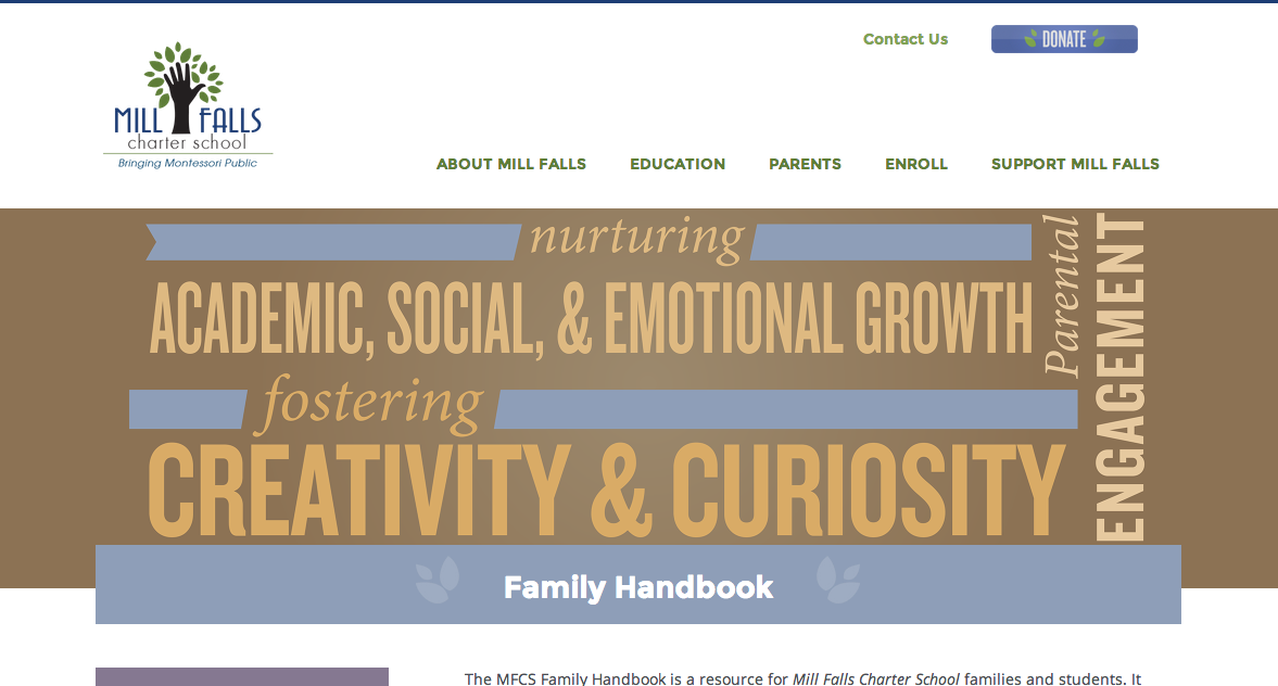
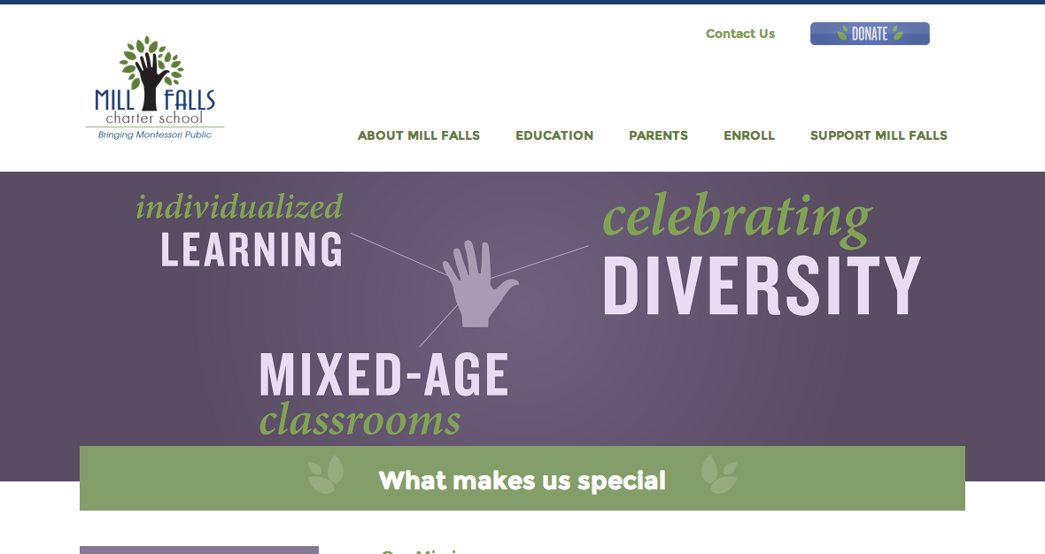
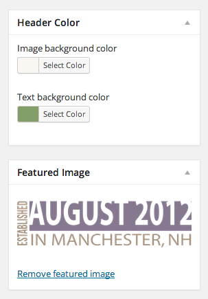
The highlight of the theme are the header images, which previously had been hidden in a slider on the homepage. We pulled them out to be used as header images for each section, with a customizable background color (the band behind the image) and text background color (the background for overlaid text).


Since I’d recently done something similar on a client site, I was able to easily pull the color picker code and create the 2 background color fields. Now that we’re asking the client to enter hex codes, we decided to add a style guide to the site for easy copy-paste color access.
We used Mark Jaquith’s WP Help plugin, and also added a guide for the typography on the site, along with some documentation on the custom functionality of the site (including a write up of what plugins were used & why).
Another bit of custom functionality was for the home page; the 3 callout boxes are widgets, and our client wanted to be able to easily add an image with text. I quickly spun up a text widget with an image field, using core’s media library.
Lastly, we created another widget for interior page navigation. This uses the menu system hierarchy to display the current top level page and all sub pages, essentially creating a per-section navigation.
Overall we went into this wanting to simplify the site, and at the same time give the client more control over the things that matter. She started the weekend unsure where to go to make changes -a problem most people have when themes come with their own control panels- and by the end of Sunday, she seemed much more comfortable with how to manage her site.
Check out the finished site at millfalls.org!