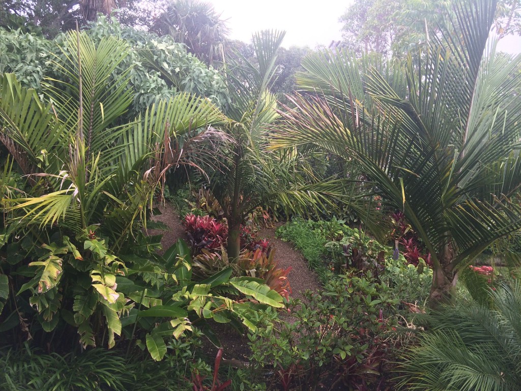
I’m on the last day of my team meetup in Auckland, New Zealand. This is the view from the balcony off my bedroom.

I’m on the last day of my team meetup in Auckland, New Zealand. This is the view from the balcony off my bedroom.
If we tell people that they don’t need to be expert developers to review themes, and that this is a good way to learn better coding practices, why don’t we do the same with design? Good design is just as subjective as code standards (in that the basics aren’t, but people like to argue about it anyway).
The quality of code in the theme repo is improved by the review process, so we should encourage design reviews to increase the quality of design, too.
Some suggestions: fill out the design guidelines in the theme review handbook (maybe with a “how to give feedback” section), then encourage designers to review themes, without worrying about doing the full code review - not all designers are or want to be developers. Publicize that this is something people can do, and it’s still contributing. Encourage people who might not be comfortable with giving design feedback to “self-report” a usability test- write out what they were thinking while activating & setting up a theme.
[Part One: Funny observations from the themes on wordpress.org]
Last time, I was trying to find some metric to give me “good” themes, and ended up looking at downloads vs ratings. That didn’t really give me anything I wanted— with no way of knowing when a theme was uploaded, I couldn’t really average out the downloads, and the older themes outweighed the new ones. So this time, I decided to play with comparisons.
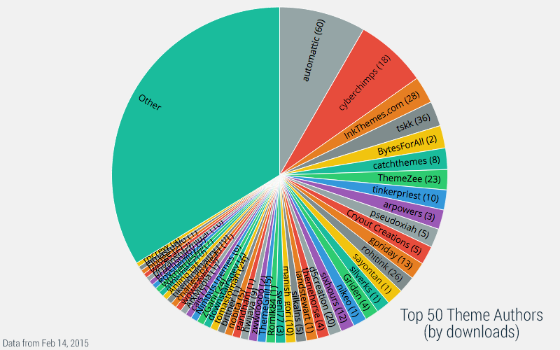
Above is a pie chart of downloads by theme author (I excluded wordpressdotorg themes, focusing just on community themes). Automattic leads, percentage-wise, as the theme author with the most downloads, followed by CyberChimps. I’m really impressed with how much the top 6ish shops command. Part of this has to do with how prolific some authors are, but I think theme age (since this is all-time downloads) inflates the number a bit.
The top 50 themes make up just over 1/3rd of all downloads. You can see how these stack up against all themes on this graph, but the names are really hard to read, so I’ve omitted “Other” from the following charts.
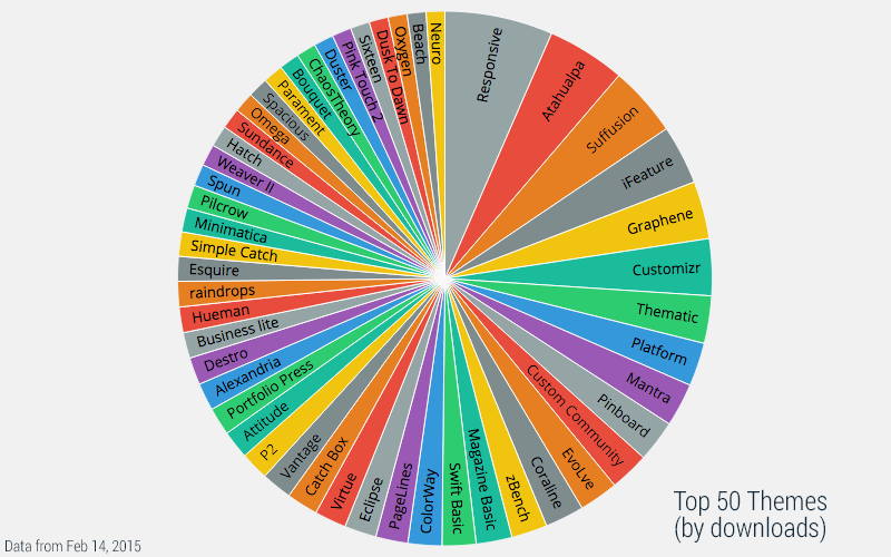
This one is all-time downloads. It mostly matches up with the theme authors, and again the older themes take the lead. To avoid this, I worked up a script to pull down the last 90 days of downloads, and sum those up.
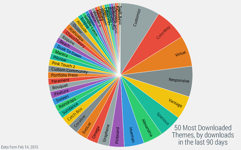
I should make it clear that this chart is not the top themes in the last 90 days. With the method I’m using now, I can only get the last 90 days’ data for a given set of themes. Regardless, it is interesting to see that my guesses about theme age affecting the downloaded rank are correct.
I’m not sure I’ll find anything super-cool in the data I’ve pulled, but it’s interesting to try. Any suggestions for what I should try to figure out next?
Last weekend I attended “Hack MS”, a hackathon aimed at reducing stress for people with Multiple Sclerosis. My mom has MS, so I decided to finally attend a “proper” hackathon (as opposed to hack days, givecamp, etc). I’m happy with the product I ended up with, and extra happy that my teammate was OK with releasing it open source… but overall I don’t think I want to do this again.
As soon as I got there, I was immediately asked to sign a video/photo release form, and it was pretty clear that there was no way to say “I’m not okay with this”. There was no explanation what the video was going to be used for, and everything screamed “marketing.” (I was too flustered to ask that night, but I did ask the next morning, and yes, it was for marketing- but I’m still not sure if it’s marketing for Biogen Idec or Hack 2.0)
Actually kind of uncomfortable with all of the surprise cameras at this hackathon
— Kelly Dwan (@ryelle) February 7, 2015
I don’t particularly like to be on camera. I never know what I should be doing, I become immediately over-conscious of every movement I make, and I can’t focus on what I was just doing*. Not a great mindset when I’m trying to create a functional product in a day.
There are of course other reasons someone might not want to be on camera (detailed at Geek Feminism Wiki), and when it came down to it the photographer and videographer were definitely professional (I wasn’t followed around or anything). But it still made me uncomfortable, because in addition to how anxious it made me, I was also wondering how much focus I’d get as one of the few women at the event. Since I have no insight into how the organizers chose photos to use, I can only guess, but my photo did in fact end up on the website.
In the end, I left some comments and links in their post-event survey, so maybe cameras will be less prominent at the next event, or there will be a clear way to opt out.
* The only exception to this is when I’m giving a presentation, like at a WordCamp (or even the project presentations at the end of the weekend). There I’m already in the mindset for people watching me, and it doesn’t put me on edge the same way.

Boston just keeps getting more and more snow. Some of those lumps on the side of the road are cars, and some are snowplow piles. I’m definitely ready for spring.
Last month, I posted about Umbra being released on WordPress.org. I’m excited about the release of this one, since I think what we did with colors is really cool.
Click through to see the demo, and be sure to click around on some posts to see the different colors.
The theme defaults to a purple, grey, and gold color scheme, but you can customize this in the customizer. By default, on single pages, it’ll also grab the color from the featured image (or first image in the post).
How did we do it? It’s easier than you might think. By pulling in some libraries from Jetpack, most of the hard work is already done. If you use the theme without Jetpack, you’ll just have the purple/gold theme in the screenshot.
Tonesque isn’t really documented in any user-accessible way, so your best bet is to go right to the source. If you check out theme-tools.php, you’ll see that to load Tonesque, Jetpack looks for theme support. This is a pretty cool feature of core, that you can add support for arbitrary theme features.
So if we want to use tonesque, all we need to do is confirm we support it.
// Support tonesque from Jetpack
add_theme_support( 'tonesque' );
Now we can use Tonesque’s methods. We’ll first create a new Tonesque object, which takes an image URL (you can check out Umbra’s source for how I get the image URL). Once we have that, we can get the sampled color from the image. (If you want to rabbit-hole like I did, you can investigate grab_color & grab_points, to see how the color is picked from the image)
$image = new Tonesque( $image_src );
$color = $image->color();A single color doesn’t really make for an entire color scheme. Luckily Jetpack has more awesome to help us out. To support using CSS preprocessors in the custom css module, it includes libraries for parsing Sass & LESS into plain CSS. Again, check out the source for all the details.
To start, I pulled all my color definitions into a single Sass (.scss) file, along with rules to generate a lot of other colors from a single “base color”. The file I ended up with is a bit of a mess - so if you’re planning on doing this, think about your colors from the start.
Note
Since we’re uploading this to WordPress.org, we can’t use the PHP filesystem methods to read from a sass file. That’s why base-scss.php is a PHP file.
After walking through how Jetpack saves and renders CSS (see get_css), I figured out that I can use the minify method, which will also conveniently minify the generated CSS. Now we can combine the global variable from our Sass PHP file with the real base color. The $sass variable now contains a valid string of Sass, and can be processed to give us our CSS. From here, we’ll inject this CSS into the header on the wp_head hook.
$sass = '$base-color: #' . $color . '; ' . $umbra_base_scss;
$css = Jetpack_Custom_CSS::minify( $sass, 'sass' );
The last step is to wrap all this in caching. We don’t want to run all this processing on every page load every time, it should only run once per color. You can check out how I handled this in generate_css.
Thanks for reading! I hope I gave you some fun ideas for how to work with dynamic colors in your themes. Feel free to ask any questions in the comments :)
Other people doing similar cool things: