[Part One: Funny observations from the themes on wordpress.org]
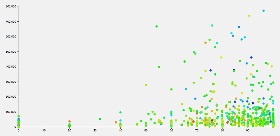
Last time, I was trying to find some metric to give me “good” themes, and ended up looking at downloads vs ratings. That didn’t really give me anything I wanted— with no way of knowing when a theme was uploaded, I couldn’t really average out the downloads, and the older themes outweighed the new ones. So this time, I decided to play with comparisons.
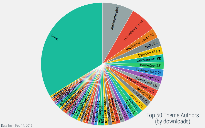
Above is a pie chart of downloads by theme author (I excluded wordpressdotorg themes, focusing just on community themes). Automattic leads, percentage-wise, as the theme author with the most downloads, followed by CyberChimps. I’m really impressed with how much the top 6ish shops command. Part of this has to do with how prolific some authors are, but I think theme age (since this is all-time downloads) inflates the number a bit.
The top 50 themes make up just over 1/3rd of all downloads. You can see how these stack up against all themes on this graph, but the names are really hard to read, so I’ve omitted “Other” from the following charts.
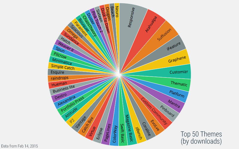
This one is all-time downloads. It mostly matches up with the theme authors, and again the older themes take the lead. To avoid this, I worked up a script to pull down the last 90 days of downloads, and sum those up.
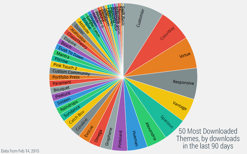
I should make it clear that this chart is not the top themes in the last 90 days. With the method I’m using now, I can only get the last 90 days’ data for a given set of themes. Regardless, it is interesting to see that my guesses about theme age affecting the downloaded rank are correct.
I’m not sure I’ll find anything super-cool in the data I’ve pulled, but it’s interesting to try. Any suggestions for what I should try to figure out next?
