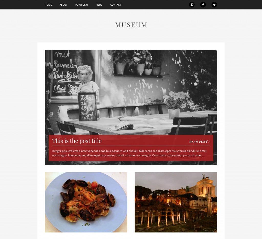
Museum is a free theme crafted to showcase all of your best photographs, drawings, or illustrations. Featuring elegant, museum-inspired typography and ample room for your images, Museum pays special attention to category and media attachment pages to help your collections shine.

Curate with categories
Create collections of image posts by adding them to the same category, and proudly show them off.
Images that stand on their own
Link to individual attachment pages with pride. Check it out for yourself.
Easy social menus
We’ve made it easy to add links to your social accounts. Just follow the handy instructions located on our documentation page.
Full responsive
Museum is crafted to look great at any screen size.
Jetpack enabled
Supercharge Museum with Jetpack galleries, carousels, infinite scroll, and Photon.
Demo Download
You can also check out Museum on Github if you’d like the LESS source files.
I adore this theme but is there any way to disable the square crop on post pages? I’m ok with it on the main page but on post pages it can ruin an image, especially panoramic images.
Hi Justin,
Glad you like it! We’ve fixed the issue in github and will be pushing it out with our next theme update.
That’s awesome news! Looking forward to seeing how it looks after the update.
[…] Museum is a free theme crafted to showcase all of your best photographs, drawings, or illustrations. Featuring elegant, museum-inspired typography and ample room for your images, Museum pays special attention to category and media attachment pages to help your collections shine. Read more about it on themes.redradar.net. […]
[…] Museum: Minimal Theme Designed for Photography Portfolio […]
Is there a way to disable to the top padding where the site title goes? I want the post area to be much closer to the navigation bar. Please help!
Sure, you could change the margin on
to something smaller. Right now it’s at 60px, but you could probably go down to 20px:
.site-branding {
margin: 20px 0;
}
Just add that to either your child theme, if you’re using one, or a CSS plugin like the one baked into Jetpack.
Hi there, I’ve created my blog using Chrome but when viewed in IE the format changes ie text boxes loses colour and images are lost. Any ideas on how to fix this? thanks
Hi! Which version of IE are you using?
IE 11
Thanks, we’ll look into this.
Awesome thanks.
This is my first blog for an assignment and as non-techie I’m struggling a bit. With this theme is there any way to move the time/date stamp from the bottom of each post to the top? (ie somewhere near the post title)
Can I change the order that the posts appear?
Many thanks
WordPress displays posts in reverse chronological order by default. There might be a plugin you could find that reverses this at https://wordpress.org/plugins/.
You can move the timestamp, but you’d need to be comfortable creating a child theme and then duplicating and editing the template files.